Web Design Trends 2016
Reading Time: 4 minutesIt’s that time of year again! As we approach 2016 time4design takes a look at some emerging web trends and those that will be sticking around for another few years.
As with all trends, they come and go, yet web design trends help communicate visually the power of a product or service. As we revisit some existing appeals, time4design also take a look at some new inclinations.
Responsive Design
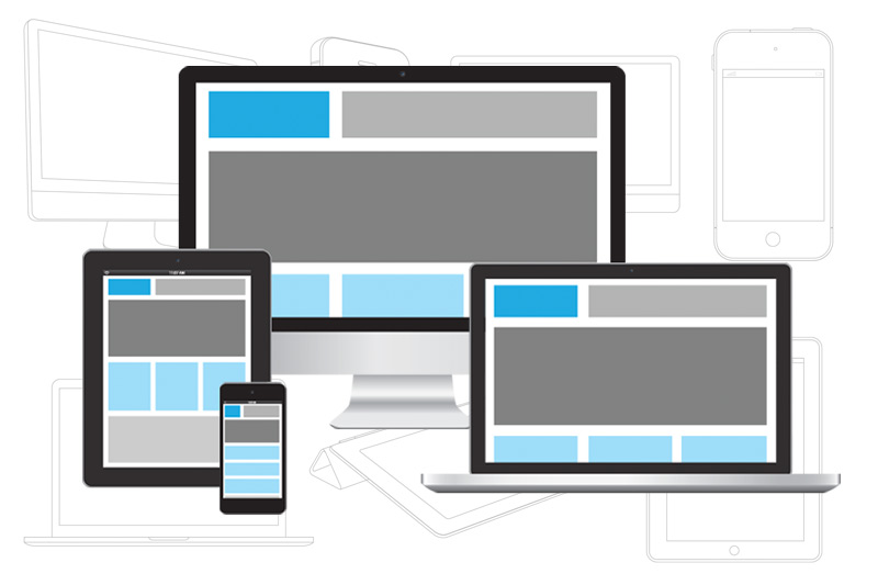
It is highly unlikely this subject area will be going anywhere. Consumers demand that a website be fully functional, whether on a laptop, tablet or smart device. Responsive design has now become the standard that is expected from most websites (unless of course there is an app available). It has been proven that difficulties with a mobile site have a higher chance of a user leaving. Even Google factors into a website ranking how friendly a website is.
Fullscreen Backgrounds
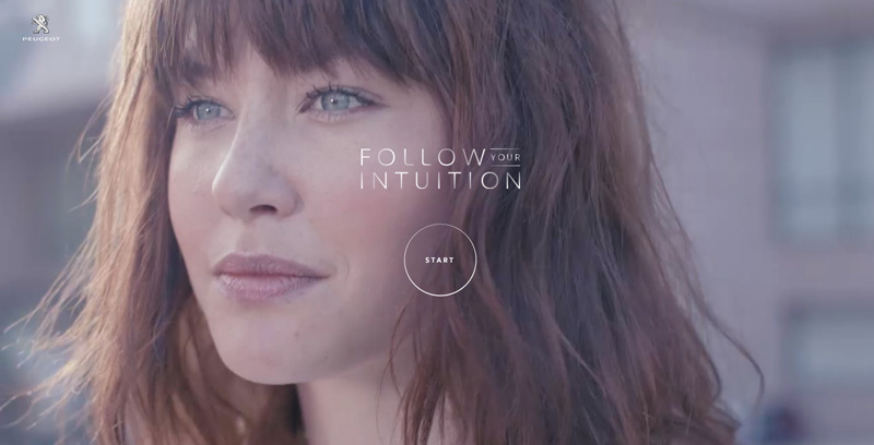
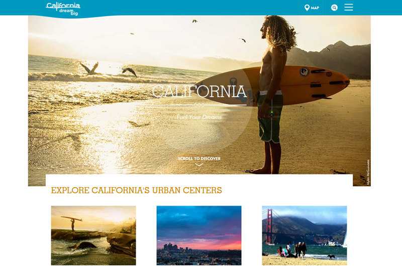
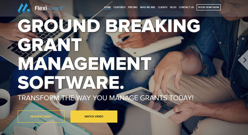
As we discussed in 2015 web trends, large backgrounds which include imagery and video have become increasingly more popular, however it is only useful for a particular type of industry. Large fullscreen backgrounds can be used in a single design quite easily but of course with small amounts of content. Fancy aesthetics can add value and demonstrate the effectiveness of the website and service. The idea of a restaurant showing its latest dish projects sheer brilliance and immediately delivers the message to the consumer!

Simplicity Design
Designers thankfully have continued to support simplicity in design, something time4design for many years has supported with our own work. A simple design works, a simple design sells! Non-essential elements are seen as redundant, presenting an organized, engaging website.
Long Scrolling
Websites are becoming overwhelmed with information on single pages as web designers find new ways to organize information. The way we scroll a website is changing, as businesses showcase products and services on one page without the need of opening other pages. In some cases, the use of infinity scrolling allows a user to continue on one page until all products have been shown, persuading the consumer into a sale.
Bold Design
Simple websites have been lending themselves to strategic approaches which has included the use of large, bold colors in order to grab the attention of the user. Together with simple interactivity such as animated text or shapes that react upon scrolling have gauged a fascinating attention level to learn more.
Preloading content

Loading screens have become more common during 2015. They are a useful method to preload content and we may be seeing new artistic expressions on how they are used in 2016. At the moment many are perhaps animated shapes with basic ‘Loading’ attributes. However, it would be the opinion of time4design, or in this case the author of writing that this will be a trend soon to fade. The main purpose of a loading screen is to help preload content that might be higher in file size to load at once or perhaps due to a poor internet connection. Whatever the case might be, this technique should only be required if it is truly needed, and not purely for web design to impress an audience who have to wait around for the next page to load.
Static Design
Simple design has seen the decline of overused animation and interactive parts such as slideshows. In order to establish a successful product or service, it is anticipated that we will be seeing more digestible content that is not distracted by moving parts.
Closing thoughts
That wraps up our thoughts on 2015. As new trends are investigated time4design will continue to take on new design directions, and explore creative, functional methods to deliver quality websites. After all, our clients are worth it!

