Lessons in Designing an Effective Education Website
Reading Time: 4 minutesDesigning an effective education website is no walk in the park. Whether you need a website for a university, a primary school, a high school, a charter, an e-learning hub or even a kindergarten, the demands seem to be ever-increasing.
And it’s no wonder: Generation Z is now enrolling in college, while Generation Alpha is now starting school. What makes these two generations special? Well, if Millennials were tech-savvy, Generation Z and Generation Alpha are tech natives.
Crummy websites, poor loading speed, or obscure discussion boards no longer cut it. These generations (and their parents – especially in the case of Gen Alpha) want a digital experience that’s fully immersive, user-friendly, comprehensive and packed with information.
Quite the tall order, right?

How does one go about creating the best educational website designs? How do you make sure that your university can attract students from all over the world through your website? How do you make the parents of your Gen Alpha students happy?
As education website developers, time4design have created web solutions for several institutions in this industry. These are a few of our design and development principles – the things we always focus on so that our clients get the results they need:
1. Get to Know Your Audience
Designing an effective education website starts with knowing your audience and their pain points. A successful design strategy lies at the intersection between their needs and your goals.
- What do they need to know?
- What information do they need quick access to?
- Which is your major selling point?
Answer these questions and you will know what the focus of your web design needs to be on.

At time4design, for instance, we always take the time to study our clients’ audience. We learn how they use a website, what they expect to find and how they define user-friendliness.
Next, we look at the competition and at the client’s needs.
Does this order seem weird to you? Shouldn’t the client always come first?
Perhaps. But keep in mind that the educational websites we design aren’t for our clients but for theirs. It’s not the educators who use the website most frequently; it’s the students. Without knowing our clients’ target audience we can’t create the kind of website they need.
2. Make the Relevant Information Shine
Minimalism may be a hot trend right now, but when it comes to educational websites it’s not your best friend.
Before you go all Marie Kondo on your homepage, remember that your students aren’t looking for a relaxation oasis. They need information about admissions, curricula, teachers, parent-teacher conferences and more.
Make sure they find it easily and that it’s not buried underneath sleek but hard to find menus and buttons.

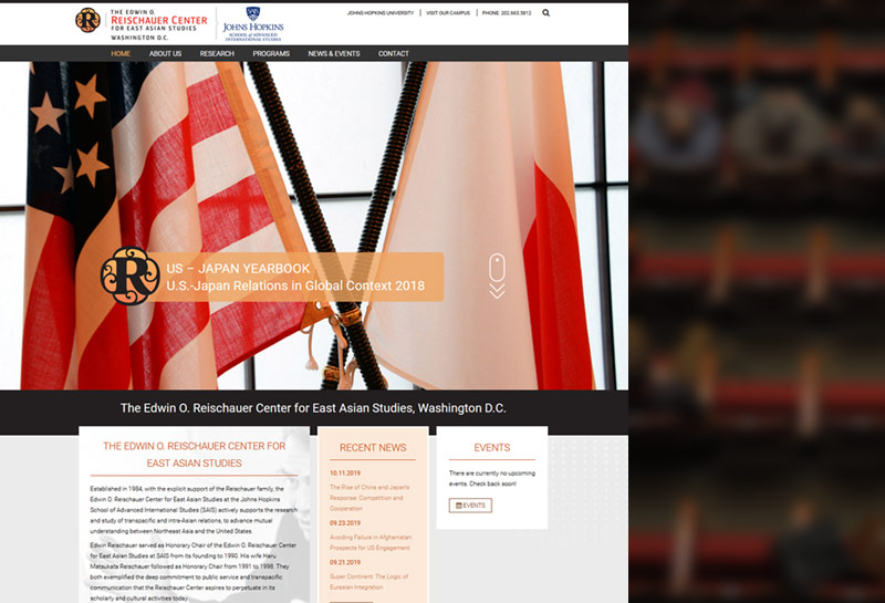
Above: The Reischauer Center’s website highlights recent news and events in a content-heavy homepage
3. Keep Everything Tidy
Speaking of Marie Kondo, you can actually learn something from her book and apply it to educational institutions web design: tidiness.
Make sure that your menus are organized according to what your students might be looking for. You can organize your content by:
- Class
- Year of study
- Course materials
- Alumni section
- News and events
If your institution is smaller, you can simply have separate spaces for each category of ‘stakeholders’: parents, children, staff and so on.

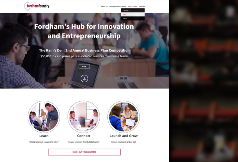
Above: Fordham Foundry has a clear menu and dedicated pages
The key point here is to make information easy to find and to avoid overcomplicating your website just for the sake of pretty design.
4. Make Your Website Responsive
95% of teens have access to a smartphone. 45% of them are online almost constantly. This is all you need to know to understand that without a responsive website, you’re practically inexistent to your target audience.
And to Google. A non-responsive website means that your rankings will drop like flies and your prospective students will have an ever harder time finding you online.
5. Pay Attention to Your Loading Speed
Speaking of ranking factors, Google has indicated that page load time is one of them. You can check your current performance here.
If the results are not what you expected, you should call your web master immediately.
Remember that your students are probably accessing your website via a smartphone, which makes loading speed even more important.
Designing an Effective Education Website – Final Thoughts
As every good marketing strategy, web design, too, starts with knowing your audience. If you take a closer look at the points above, you will see that they all stem from the needs of the generations who are in school right now or will be soon.
Educational institutions face fierce competition today. And the first place to generate great leads and convince potential students and parents that you are worth a second look is the internet. If your online presence is not as good as your competitors’, you will lose the attention and interest of your prospects.
