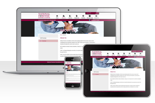
Smart phone and tablet design – Responsive web design
Reading Time: 2 minutesIn our last article we spoke about some of the recent web design trends to look out for in 2012. One particular subject discussed was ‘Responsive Web Design’ and how this would affect general web design techniques. There has been some confusion lately to actually understand what responsive design involves. Some websites appear to be optimized simply for certain devices while others might require downloading an app or redirecting to a mobile website.
It has been almost 5 years since smart phones were introduced and its market has increased at popular rate. With so many internet users on their smart phones, it’s quite logical to understand that businesses want to make sure that their customers receive a friendly user experience by simplifying usability. Most websites are designed for large screens, however designing for mobile (and tablets) are a completely different method of thinking in comparison to common web design. New design standards and practices have been introduced that will now allow us to create user-friendly sites, seamlessly and practically.
As the title suggests, Responsive Web Design allows us to create a flexible layout that dynamically will be catered for all devices at any resolution. As the user switches from their desktop to smart phone or tablet, the websites layout accommodates resolution, image size and style. The mobile or tablet website will automatically respond to the user’s preferences. This advantage here is that we do not have to create an app or separate website specifically for that device or other devices that might be introduced to the market.

Above: NFC. Time4design will design and develop a responsive version of your website. Give our Philadelphia office a call today.
A mobile enabled website should be short and sweet. Simplicity is a key ingredient as mobile browsers are not going to load pages as fast as a desktop. Content and image placement should be considered and placed into a one column layout. Unnecessary images and animated content should be removed as this will only cause layout issues.
The conclusion…
Responsive web design certainly will integrate with more and more websites over the next few years. It’s a practical technique that will enhance your website and improve customer experience and ROI.
